


Case Study
Richard Prince richardprince.com
Richard Prince Case Study
Magazines, books, movies, TV, records, cars, paintings, drawings, sculpture, houses, fashion, sunsets, advertising…welcome to richardprince.com. When Richard Prince, the American artist and collector best known for his appropriations and reiterations of images, approached exhibit-E about designing a new website for him, he provided a clear brief: he needed a website that could handle lots of content, that would be easy to navigate and that would support a broad array of back-end capabilities, giving the artist the flexibility to use the site as a tool of expression. The site he was using at the time was outdated and even the most basic changes were challenging. The only option that would give him the dynamic site he wanted was to custom design a new website.
Prince is a prolific artist, collector, writer, receiver of information and obsessive observer. His interests are varied and the website reflects that. Rich in content, the website offers an extensive presentation of his work, interests, writing and collections, and gives him a broad palette to explore and express himself in this newer medium. Our aim was to create a platform for the artist that was visually stunning, slightly irreverent, simple to navigate and easily managed by the artist and his studio. We adopted a bold graphic feel for the design, utilizing a condensed sans serif typeface. The page layouts evoke the aesthetic of a rock poster, with strong graphic elements and an intentional echo of randomness. The design feels intelligent, organized, and current.
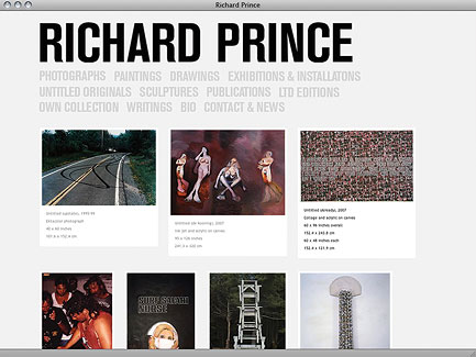
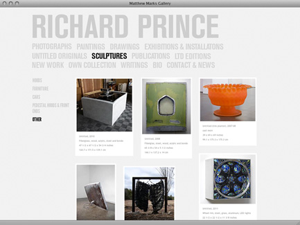
The website’s home page greets the visitor with a bold “Richard Prince” headline, black font in all caps against a light gray background. Underneath this are the featured content categories, displayed horizontally in line, in gray font, all caps. These categories serve as clickable navigation bars, which take the visitor deeper into the content of the site. Beneath the categories layout are panels displaying artwork, easily changed whenever the artist desires. The effect is concise and visually impactful.
Navigating the website is seductively simple, enticing further exploration into the site. The bold, all-caps type is represented in three color states for clarity of navigation: black, gray and blue. It’s a muscle car blue, bright and assertive. The minimalist color palette does not distract. Roll over a category and the typeface changes to blue; click on a category and it changes to black, while the “Richard Prince” header type and all the other navigation type turn light gray. This lends an unexpected softness to the otherwise bold graphic presentation. Then another pleasant surprise—roll over the gray “Richard Prince” header and it turns blue; roll over any of the gray categories and they turn blue too. The effect is almost tactile.
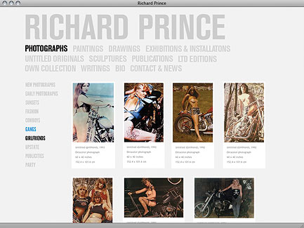
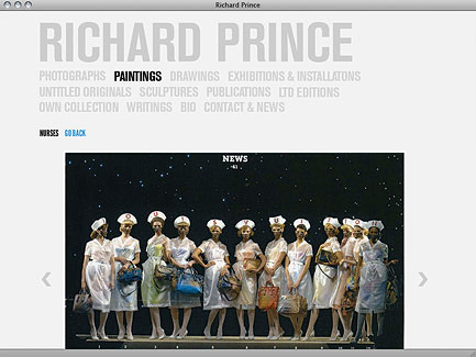
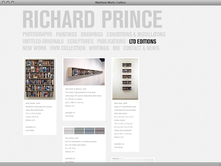
Prince has opted to organize his website into twelve content categories, which serve as the site’s main navigation menu: Photographs, Paintings, Drawings, Exhibitions & Installations, Untitled Originals, Sculptures, Publications, Limited Editions, Own Collection, Writings, Biography, and Contact & News. Click on “Photographs” and you are taken to a section of the site devoted primarily to Prince’s photographic images. A menu of subsections, arranged thematically, appears on the left side of the screen. Thesite allows him to add new subsections (or subtract existing ones) as the need arises. From a design perspective, it’s a beautifully simple and clean interface, which allows the artwork to occupy center stage without distractions.
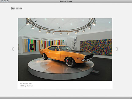
Click on “Cowboys,” for instance, and you are taken to a page of thumbnail images representing each of the pieces in this category of work. Click on a thumbnail, and you are taken to a gallery where each of the pieces in this category of work is displayed, one at a time, in a spare viewing pane that fills the computer screen. Each piece of art is clearly identified and dated. You can scroll back and forth through this gallery using the generously-sized left and right navigation arrows, or jump back to the subcategory page with a single click. iPad users will find the arrows ideal for navigating with their thumbs. No matter which page you are viewing in the website, the home page menu is always right there at the top of the page, making for easy, intuitive navigation.
As you browse through the various categories from the main menu, you will find the same intelligent design framework with subsections consistently placed and clearly displayed on every website page. The artist is free to add, modify, disable, or delete subsections throughout the site, as the need requires. He is not limited by the website design. In terms of layout, in any section of the website where there are thumbnail images, these are displayed on the page in an imperfect grid that appears slightly random, as if the artist has laid the images down on a table for you to view. The slight randomness is intentional and system-generated.
Unique to this website, Prince has included glimpses of his own extensive collection of art, books and stuff in general, lending the sitethe air of a work in progress. The site’s value added is that the artist is using the medium to reveal his creative process—we are gifted with what feels like a very personal view into his hobbies, his obsessions, his library, his homes and other things that lend context to his work. As Prince once said about his art, “A lot of it is experimental, spontaneous. It’s about knocking about in the studio and bumping into things.” The website allows us a glimpse into that process.
Browse to the “Own Collection” section of the Website, and you’re treated to photographs of Prince’s houses and other buildings, with what appears to be his personal art collection in situ. Also shown are photos of individual paintings, photos of books and manuscripts from his own personal library, and photos of albums, posters and artifacts he’s collected over the years.
The “Exhibitions and Installations” section of the Website provides links to artwork from Prince’s recent exhibitions, as well as images of installations featuring his work. In a refreshing variation in the design, the “Exhibitions” page uses a single column format, with featured content displayed in horizontal rectangles, framed by the light gray background common to the rest of the site. The title, venue and dates of each featured exhibition are shown neatly on the left, with an image of art from the show on the right. Click on an exhibition, and you are taken to a page of thumbnails of images of works from that exhibition. Click again on a thumbnail, and you are taken to a gallery where the image is displayed in its own viewing pane, filling the screen.
The “Writings” section includes a selection of Prince’s written work. The layout here is suggestive of newspaper clippings. The first few paragraphs of each “story” are shown as gray text against a white background, displayed in vertically oriented rectangular columns, arranged on the page in seemingly random order against a light gray background. If you are hooked on a story after reading the first few lines, click on “Read More” and you are taken to a new page where the entire story is displayed in a wider, letter size format for easy reading.
Like all exhibit-E websites, the site has an easy to use administrative interface, which allows the artist to manage content with a minimum of effort. Adding a subsection under one of the twelve menu categories is effortless, requiring just a few keystrokes and clicks of the mouse. So too is populating that new subsection, or an existing one, with images of artwork and with accompanying text. The process is no more involved than attaching a photo to an email.
Our aim was to create a platform for the artist that was visually stunning, slightly irreverent, simple to navigate and easily managed by the artist and his studio.
Reach Us
Contact
Inquiries
Location
Info
NY (212) 966 4064
L.A. (323) 928 4390
NY Office:
200 Broadway
Suite #304
New York, NY 10038


